I wanted to see what actual data said about how much hotter it has gotten in my area during my lifetime. I know climate change is going on at a global level, but I just cared about my area, is it actually getting noticeably warmer, or is it just my imagination?
Before we go any further I should stress I'm not trying to prove or disprove climate change, or do any sort of serious climate science here. I'm just trying to answer the question: Is it actually noticeably hotter here in the Philly area now than it was when I was a kid?
I've seen graphs of average temperature over time for cities before, but I feel like they tend to use average temperature over the year. Which, I'm sure is a more important data point for climate science, but again, I only care about if I feel hotter here. I don't really care about days that would have been 50F and now are 60F. I decided the right metric to use for me is how many days over 90F per year do we see? Is that number going up?
I won't turn this into a huge post. I grabbed data from the NOAA here, in a CSV for the Philly airport from 1980 to 2021, which roughly matches the time I've been alive. I threw that into a database and queried the count of days per year over 80F and over 90F, and graphed both, with trend lines.
Before I put the trendline on there, I have to admit I thought the 90F version didn't show any increase. But then I noticed how few years had less than 20 days over 90F recently vs the 80s. We haven't had a year with less than 10 days over 90F since 2014.
The over 80F version is a bit harder to read, but I feel like it shows the upward trend better, particularly if you focus on the 100 days line. In the 80s there were a few years with more than 100 days over 80F. In the 90s it was about half the years. In the 2000s it was most, and then in the 2010s it was all but 2, which barely snuck in under the line.
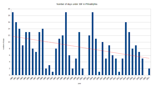
For fun I also looked for number of days where it never went above 30F. Note this isn't just the daily low, this is the warmest it got on any given day, or in other words, days where it never got above freezing. Spoiler alert, it's also getting less cold.
I did also pull the lows and looked at those, they showed similar trends. The 1980s had an average of 25 days below 20F, the 2010s had an average of 13 days, and 2021 had exactly 1. The one graph I will post from the lows is this one of the number of days where the low is over 70F. In other words, days where it never goes below 70F, even over night. If you're looking to cool your house by opening the windows over night and closing them during the day when it heats up, it's going to be pretty tough to do if it's not going below 70F at all (which probably means it's still over 80F when you're going to bed).
I was actually surprised at how clear the trend was in the data, and in every single version of the data I could think of to look at. There wasn't a single dimension I looked at that didn't show this trend. Turns out it is hotter now than when I was a kid. Not a fan.


No comments:
Post a Comment